

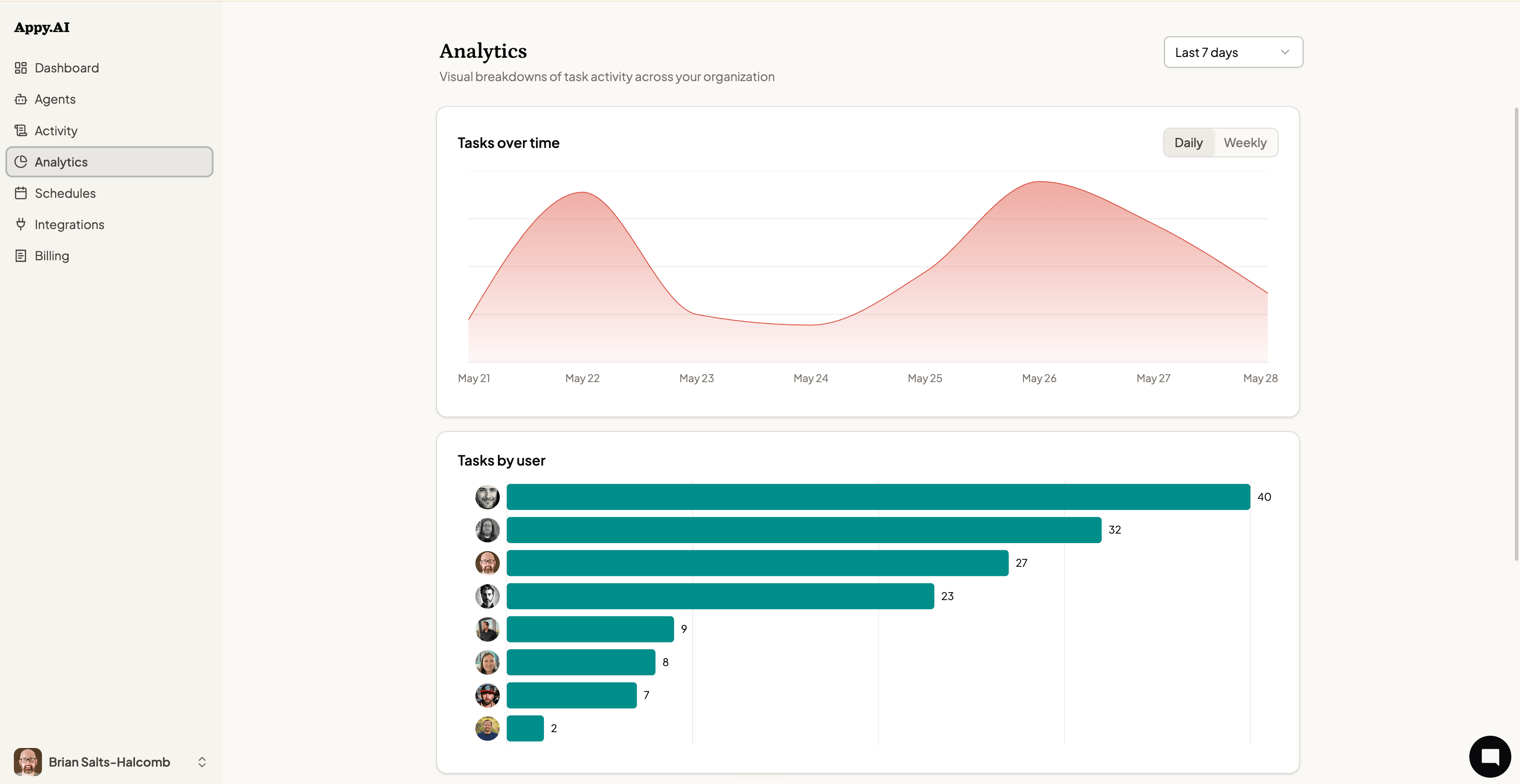
Time range
Use the dropdown in the top-right corner to change the time window:- Last 7 days
- Last 30 days
- Last 90 days
Tasks over time
The Tasks over time chart plots daily (or weekly) task volume as an area chart. Switch between Daily and Weekly views using the toggle in the top-right of the chart. Use this chart to see whether agent usage is growing, spot spikes tied to specific projects, or identify quiet stretches where adoption may be lagging.Tasks by user
The Tasks by user bar chart ranks every team member by the number of tasks they’ve initiated in the selected time window. Each row shows a profile photo alongside their task count.Tasks by medium
The Tasks by medium radar chart shows how tasks are distributed across channels — web, Slack, email, schedule, and webhook. This tells you where your team naturally reaches for their agents most.Tasks by agent
The Tasks by agent radial chart shows which agents handled the most tasks in the period. Agents are plotted by name with bar length proportional to task volume — useful for understanding which specialists are carrying the most workload and where there may be underutilized agents.Assets produced
The Assets produced donut chart breaks down the files and outputs your agents have generated by type:- Markdown — Notes, research, reports, and summaries
- Document — Word documents, PDFs, and formatted reports
- Image — Generated or edited images
- Code — Scripts, configuration files, and code snippets
- Other — Any additional file types
Analytics data updates continuously. There’s no need to refresh — the charts reflect activity as it happens.